EY refers to the global organization, and may refer to one or more, of the member firms of Ernst & Young Global Limited, each of which is a separate legal entity. Ernst & Young Global Limited, a UK company limited by guarantee, does not provide services to clients.

Accessibility testing benefits everybody, allowing you to create an inclusive world, and that’s something worth shining a spotlight on.
In brief:
- Digital accessibility testing involves assessing websites or apps based on the Web Content Accessibility Guidelines to ensure usability for all users.
- Accessibility testing needs to be conducted across the software development lifecycle and should involve manual, automated, user, and user experience testing methods.
- Accessible design not only benefits people with disabilities but also general users, enhancing user experience and catering to a broader customer base.
What is digital accessibility testing?
Accessibility testing is a step-by-step process of thoroughly examining your website, apps and other digital content against the standards dictated by the World Wide Web Consortium’s Web Content Accessibility Guidelines (WCAGs) to make digital content usable to as many people as possible.
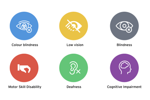
The WCAGs were developed to address an individual’s practical, physical, cognitive and emotional needs so that it makes apps accessible to those with disabilities such as vision impairment, lack of motor skills or hearing disability. They are a key element in application development and work best when incorporated into your testing strategy on a regular basis throughout the software development lifecycle (SDLC).
Accessibility testing benefits everybody, not just the disabled. Digital accessibility allows you to create an inclusive world, and that’s something worth shining a spotlight on.
The one argument for accessibility that doesn’t get made nearly often enough is how extraordinarily better it makes some people’s lives. How many opportunities do we have to dramatically improve people’s lives just by doing our job a little better?
Who needs better accessibility?
Accessibility helps a wide range of folks, including those with varying visual, auditory, physical, cognitive, learning and speech adversities.


Ever wondered what #A11y stands for?
You might have seen the hashtag #A11y on platforms like X, LinkedIn, Facebook or Instagram. A11y (pronounced “A-one-one-Y,” “A-eleven-Y” and liberally as “ally”) is an abbreviation for “accessibility.” The number 11 represents the 11 letters between a and y in “accessibility.” It refers to how accessible software is to everyone, including those with disabilities.
By making a few changes to your website or application, you can make the difference between aneasy-to-use and inclusive interface and one that is difficult, frustrating and exclusive of some communities. By keeping web accessibility in mind, your online services are available to more users.
Understanding digital accessibility standards
The WCAGs were established with global input from a wide selection of international organizations known as the World Wide Web Consortium, or W3C, to provide technical specifications with the purpose of improving the accessibility of digital content for people with a wide range of disabilities. WCAG 2.0 was published on December 11, 2008. WCAG 2.1 was published on June 5, 2018 and WCAG 2.2 on October 5, 2023. It’s leading practice to use the most recent version of WCAG for the greatest accessibility.
Four basic principles
The accessibility standards are based on the four fundamental principles known as POUR: perceivable, operable, understandable and robust.
1. Perceivable: Information and user interface (UI) components must be presented to all users in a perceivable manner; content can be presented in different ways that users can easily process.
2. Operable: UI components and navigation must be operable by all users using a keyboard rather than a mouse.
3. Understandable: Users must be able to understand and use the content of a website and be able to navigate with a clear understanding.
4. Robust: Content must be robust enough to be interpreted by various platforms, browsers, devices and assistive technologies.
Three levels of conformance
Each WCAG guideline has a list of requirements, or “success criteria,” for testing your content for accessibility based on three levels of conformance:
- A — minimum accessibility
- AA — addresses the major, most common accessibility issues
- AAA — the highest standard
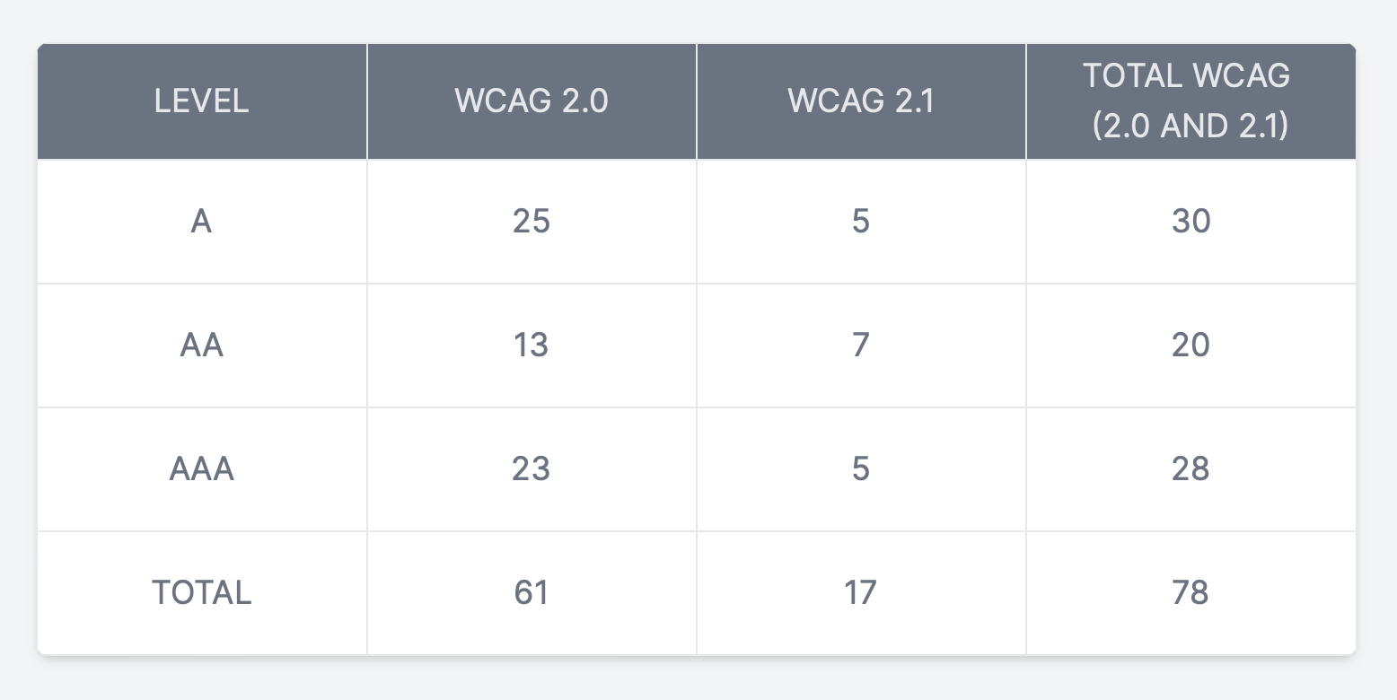
The success criteria found in WCAG 2.0 are included in WCAG 2.1; the only difference is that WCAG 2.1 includes 17 new success criteria to benefit more people.
To differentiate between the levels, let’s take the use of colour as an example. At Level A, you can’t identify something by colour. With Level AA success criteria, you must meet colour contrast standards. Meeting Level AAA success criteria means adding an enhanced level of colour contrast or a removal of any element that flashes three times per second for the safety of those with epilepsy. The following table depicts the levels and success criteria for each.

Why does accessibility testing matter?
According to the World Bank, “one billion people, or 15% of the world’s population, experience some form of disability, and disability prevalence is higher for developing countries.”
That’s a staggering number. This means that around one billion people may experience some degree of difficulty when interacting with an application or any software product. In the US and Canada specifically, one in five people is diagnosed as having a disability.
WebAIM conducted a study in 2020 that found the vast majority of websites do not offer a fully accessible experience. Fewer than 2% of the world's top one million websites are meeting the needs of the disability market.
Furthermore, more than 7 out of 10 web users with disabilities won’t tolerate non-accessible websites¹. Instead, they’ll leave a website in search of one that’s more accessible, which can increase a website’s bounce rate and harm its organic rankings.
When colour contrast is low, menus don’t open properly, fonts are too small and links aren’t clear, the result is a bad user experience for everyone. When users visit your site in these conditions, they’re unlikely to stay unless they absolutely have to. These types of sites are frustrating for everyone to use, and especially frustrating for people who use the web with assistive technologies.
When developing software, it is critical to have all users in mind, especially those with disabilities. To make sure a wider range of users can use applications without difficulty, we need to understand and address their challenges.
No matter the industry, this is where accessibility testing can help. As a tester, it is our responsibility to perform accessibility testing on applications so that people have equal access to digital content, no matter their abilities or preferences. Really, the aim of accessibility is to make your websites and apps usable by as many people in as many contexts as possible: users on mobile devices, users of older devices, and users on alternative browsing devices such as TVs and watches.
Making applications accessible will not only improve the user experience, it will also make everyone feel more welcomed, providing them equal rights to the digital world.
A commitment to accessibility for all people, especially those with disabilities, can offer a better user experience, open your business to millions of potentially untapped customers, help your business boost search engine optimization (SEO), avoid expensive lawsuits, and so much more. From the inclusion standpoint, making it easy for people with disabilities to use your website is also the right thing to do. The bottom line is: accessibility testing matters.
The power of the web is in its universality. Access by everyone regardless of disability is an essential aspect.
How to perform accessibility testing
Accessibility testing should be taken into account throughout the software development lifecycle. This way you can find errors early and avoid costly repairs later in the process. As you add content and make changes to your site, accessibility issues will inevitably arise. Testing your site regularly will help you solve these problems.
Accessibility testing should be performed:
- Before launching a new site
- At regular intervals for accessibility maintenance
- When you significantly update your site content
- After conducting a site redesign
In this section, we will explore how to perform the four types of accessibility testing.
Manual accessibility testing includes but is not limited to testing your website with a keyboard instead of a mouse, with images or style sheets turned off, and magnifying the screen. These types of tests imitate how someone with low vision or limited agility might use your site.
One of the major pros of manual accessibility testing is getting a new viewpoint on the material by including the human element in the testing process. In this case, it’s the difference between computerized testing and human observation. As advanced as software technology is, there are many situations where an algorithm can’t recognize the nuances necessary to building a website that works for people of varying abilities. To get a truly comprehensive testing process, it is leading practice to perform testing using a screen reader, with speakers and microphone off, and no mouse.
Keeping your website compliant with WCAG 2.1 Level AA accessibility standards is the ultimate goal. When performing accessibility testing, it is helpful to use the WCAG guidelines checklist ,which covers the four fundamental principles — perceivable, operable, understandable, robust — of accessibility standards.
It’s leading practice to document all your test findings and share them with the team and the client. Include in the reports the scope of the study/testing and evaluation parameters, such as testing methods and user characteristics. This helps in prioritizing issues that need to be addressed first.
One of QA’s best practices should be to incorporate accessibility testing from the early stages of the software development lifecycle such as the design phase and continue performing it throughout — with the understanding that people use websites in very different ways and with the passion to make applications accessible to as wide an audience as possible.
Tools to perform accessibility testing
Remember, the goal of accessibility testing is to remove barriers on the web so that all people, regardless of abilities, can access the same information and perform the same functions. By performing accessibility testing, removing barriers and building a better user experience for everyone, you’ll know that you have played a part in building a web for all.
There are many good automated tools available for accessibility testing, which we outline below.
● Screen readers
- Windows: Download JAWS² (Job Access with Speech) or NVDA³ (Non-Visual Desktop Access)
- The NVDA User Guide⁴ is a helpful resource when getting started.
- Android: TalkBack⁵ or any in-built screen reader.
- Mac and IOS: VoiceOver⁶ is already built in and can be turned on in accessibility settings.
- Chromebook: ChromeVox⁷ is a built-in screen reader that enables people with visual impairments to use the Chrome operating system.
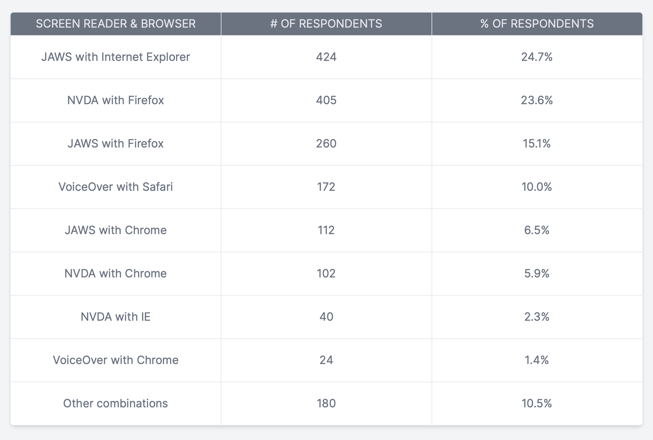
According to the WebAIM Screen reader survey, we can see from the below table that JAWS works well on Internet Explorer, followed by NVDA with Firefox and VoiceOver with Safari.

What screen reader should you use for accessibility testing? I recommend:
- JAWS with Internet Explorer on Windows
- NVDA with Firefox on Windows
- Voiceover with Safari on IOS and OSx
- Talkback with Chrome on Android
Automated testing tools: Automated accessibility testing tools analyze your site for conformance to the WCAG. These software programs and online services can help you determine whether your site has coding, design, content or other issues that would make it harder for a person with a disability to use your site in the way it’s intended.
The top #A11y tools include:
- Wave chrome extension provides visual feedback about the accessibility of your web content by injecting icons and indicators into your page.⁸
- SortSite PowerMapper is a popular one-click user experience testing tool for Mac, OS X and Windows. It scans any website for broken links, spelling errors, browser compatibility, accessibility, web standards validation and search engine issues.⁹
- Axe DevTools is a powerful chrome extension to identify accessibility issues on your website.¹⁰
- The A11y Machine (or a11ym for short, pronounced “alym”) is an automated accessibility testing tool that crawls and tests pages of any web application to produce detailed reports.¹¹
- Axe-Selenium-Java offers the ability to perform web accessibility testing with JUnit and Selenium.¹²
- Pa11y.org has a bunch of tools you can use to help automate your accessibility tests
- Google Lighthouse is an open-source, automated tool for improving the performance, quality and correctness of your web apps.¹³
- Color Contrast Analyzer extension allows you to check for text colour contrast problems on a website.¹⁴
- Color Oracle is a free colour blindness simulator for Windows, Mac and Linux.
- Tenon is a web accessibility testing tool that is known for giving flexibility for designers when evaluating a site’s accessibility.¹⁵
- Siteimprove is a great chrome extension that provides you with actionable information regarding all the accessibility issues it detects.¹⁶
Myth 1
Accessibility only affects a small group of users.
Around 15% of the world's population, or an estimated 1 billion people, live with disabilities.
Myth 2
Making a website accessible is expensive and time consuming.
If accessibility is considered from the beginning of the project and a development team has the proper skills, then it is not costly or time consuming.
Myth 3
Disabled users do not use my website.
Many people with disabilities like colour blindness, limited motor skills and others use websites just like any other users.
Myth 4
Accessibility is only about adding alternative text to images.
There are many things to be considered while making an accessible website besides alt text, including headline structure, functional controls, colour contrast and much more.
Myth 5
Using automated tools is all I need to do to make my website accessible.
Automated accessibility testing can only find 30% to 50% of all accessibility issues.
Myth 6
Web accessibility is just a developer's responsibility.
It's a team effort. Designers create accessible designs, developers build the application, QAs do the accessibility testing and PMs make sure accessibility is included in the team processes.
Myth 7
Accessibility can only be tested by disabled people.
Everyone can learn how to test websites for accessibility.
10 tips to make your website accessible
Software applications should be designed in such a way that it is accessible by every differently abled customer, understanding their needs and behaviour so they can use that product with ease.
- Use headings properly.
- Do not skip heading levels. Use headings and subheadings to form an outline of the page. This helps non-sighted users understand how the page is structured and makes it easy for screen reader users to navigate.
- Add proper alternative text to images.
- Add alt text to images to provide access for individuals who cannot see them, including those using Braille output devices or screen readers. Alt text can also help improve your site’s SEO. Write descriptive summaries of each image and include appropriate keywords.
- Provide sufficient colour contrast.
- Use a clear contrast for foreground and background to ensure users can distinguish the various elements on the page. Avoid creating a palette where the colours are too similar in saturation and hue. WebAIM is a great online tool to find and test colour combinations in real time.
- Ensure your site is keyboard friendly.
- Design your website to be operable by keyboard-only navigation #nomouse. This includes accessing all links, pages, content and other resources using the Tab key on your keyboard.
- Make content easily accessible and use ARIA landmarks.
- Use ARIA landmarks by adding tags to dynamic content. Dynamic content can change without the page reloading. This can be an issue if the site doesn’t inform assistive tools of the change. For example, many screen readers will read the site as it appears when it first loads. To avoid the user missing new content, you can use ARIA landmarks by adding tags to dynamic content. This will enable the screen readers to understand the content as it changes. Landmarks also allow non-sighted users to navigate and find content quickly. Simply add an HTML attribute for one of the eight landmark roles (e.g., role=“navigation”, role=“main”) and users will be able to go directly to that section of the page with a single keystroke.
- Design your forms for accessibility.
- Ensure each form field is clearly labeled, adjacent to the respective fields. Provide instructions and information in a clear manner.
- Create accessible PDFs.
- Use “tagged PDF”. This is the only type of PDF that supports alt text for images and headings.
- Mark up tables appropriately.
- Use HTML markup to communicate relationships between columns and row headers. It’s best to use tables for tabular data only and not for anything else such as layouts or lists.
- Identify language of text and think about word choice.
- Identify the document language using the <html lang> attribute with a valid value (e.g., <html lang=“en”>). Ensure all lang attribute values are valid. Identifying the language of the page or page elements allows screen readers to read the content in the appropriate language. Use simple and clear language that is easy for the user to understand.
- Caption video and provide transcript.
- Transcribe and caption video and audio so individuals who are deaf or blind and those with low internet bandwidth can easily access the content.
Accessible design is good design — it benefits people who don’t have disabilities as well as people who do. Accessibility is all about removing barriers and providing the benefits of technology for everyone..
Summary
Digital accessibility testing, based on the Web Content Accessibility Guidelines, is a critical step in ensuring optimal usability. It involves various testing methods applied throughout the software development cycle. An accessible design benefits all users, enhancing overall user experience and inclusivity.


